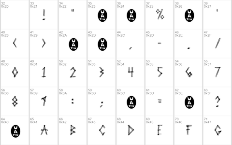
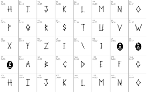
Download free 2 Prong Tree font - Free fonts download
(0 vote)
Download free 2 Prong Tree font by Free fonts download free for Personal Use. Font list styles: 2PROT___.TTF,
Download font
Free for Personal Use
This fonts are authors' property, and are either shareware, demo versions or public domain. The licence mentioned above the download button is just an indication. Please look at the readme-files in the archives or check the indicated author's website for details, and contact him if in doubt. If no author/licence is indicated that's because we don't have information, that doesn't mean it's free.
2 Prong Tree | 2PROT___.TTF
- Font family: 2 Prong Tree
- Font subfamily identification: Regular
- Unique identifier: Macromedia Fontographer 4. 1 2 Prong Tree
- Full font name: 2 Prong Tree
- Version: 1. 0 52497
- Postscript font name: 2ProngTree
- Trademark notice: UnAuthorized Type
- Manufacturer name: UnAuthorized Type
- Designer: Ben McGehee
- Description: This version includes only capital letters, and some commonly used punctuation. plus the new UA Type dingbat just to amuse myself. When I was sitting in Huddle House one night, drinking coffee, I was showing my girlfriend the fonts I was working on. I drew out 3-Prong Tree, and she said that she didn't like it. She told me to do it with just 2 lines on every letter. So I tried that with this one. She realized after the finished product of 3-Prong Tree that it was good, but I went on and did 2-Prong Tree just to see the difference. 3-Prong looks better at smaller point sizes because it's fatter, but 2-Prong Tree looks better at larger point sizes because the letters are cleaner.
- License: You use this font in any way that you see fit. If you distribute it, I would like for the readme text file to accompany it. That's just so they know who made it. You may distribute it on CD, disk, or any other medium, but you may not sell it.
Comments (0)
Please login!
By Free fonts download
Madelina Script fontPersonal Use Free
Brother Lands fontPersonal Use Free
Southampton fontPersonal Use Free
Lastest fonts
Madelina Script fontPersonal Use Free
Brother Lands fontPersonal Use Free
Southampton fontPersonal Use Free
Submarine Beach fontPersonal Use Free
Martian Vacation fontPersonal Use Free
Return Policy DEMO fontPersonal Use Free
Route Du Soleil DEMO fontPersonal Use Free
Abandoned fontPersonal Use Free
Banda fontPersonal Use Free
Create Something Today fontPersonal Use Free
Travel Light Personal Use fontPersonal Use Free
Last Frontier Personal Use fontPersonal Use Free


