Download free Donner font - Free fonts download


Download font
Free for Personal Use
This fonts are authors' property, and are either shareware, demo versions or public domain. The licence mentioned above the download button is just an indication. Please look at the readme-files in the archives or check the indicated author's website for details, and contact him if in doubt. If no author/licence is indicated that's because we don't have information, that doesn't mean it's free.
- Donner Regular donner.regular.ttf
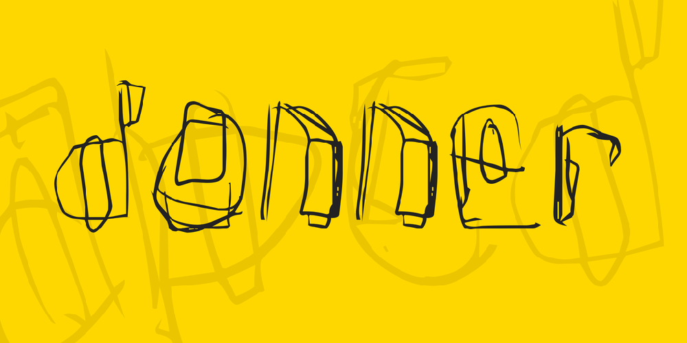
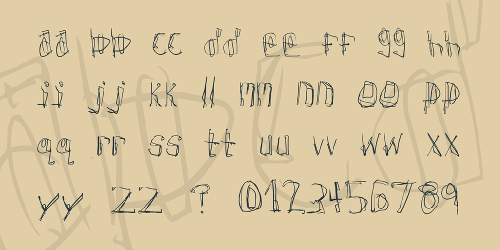
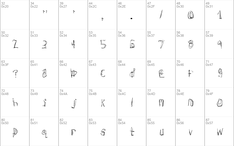
Donner Regular | donner.regular.ttf
- Font family: Donner
- Font subfamily identification: Regular
- Unique identifier: Frog: Donner revision 1
- Full font name: Donner
- Version: Revision 1
- Postscript font name: Donner
- Trademark notice: Donner Copyright c 1997 Tom Murphy 7
- Manufacturer name: [Divide By Zero] Fonts
- Designer: Tom Murphy 7
- Description: Created by Tom Murphy 7. This is a uh, what font am I doing? font. . . Just look at it. [Divide By Zero] fonts: http:members. aol. comvroomfondettf
- License: Here is the summary of the license for this font, which may be overridden by most likely very similar new licenses at the URL below. NO MONEY must ever exchange hands for this font file, without EXPLICIT WRITTEN PERMISSION from the designer. This means you MAY NOT SELL THIS FONT on a font-collection CD, nor singularly nor part of any other type package. You may distribute this font file to anyone you want, as long as you do not modify it and do not charge any money or services. You can use this font in noncommercial applications and websites freely and without the designer's permission. You can use this font for commercial purposes provided you notify the designer ImightbeTM@aol. com and provide him with a free sample of the associated product, where appropriate. Your conscience gets to decide what is appropriate. For the full license and updates: http:members. aol. comvroomfondettflegal. html Mailing address: Tom Murphy 7 339 Still Hill Rd Hamden CT 06518. 1830 USA
donner-eula
Fontsonline Free For Commercial Use License (FFC)
Preamble
In this license, 'Donner' refers to the given .zip file, which may contain one or numerous fonts. These fonts can be of any type (.ttf, .otf, ...) and together they form a 'font family' or in short a 'typeface'.
1. Copyright
Donner is the intellectual property of its respective author, provided it is original, and is protected by copyright laws in many parts of the world.
2. Usage
Donner may be downloaded and used free of charge for both personal and commercial use. Personal use refers to all usage that does not generate financial income in a business manner, for instance:
- personal scrapbooking for yourself
- recreational websites and blogs for friends and family
- prints such as flyers, posters, t-shirts for churches, charities, and non-profit organizations
Commercial use refers to usage in a business environment, including:
- business cards, logos, advertising, websites for companies
- t-shirts, books, apparel that will be sold for money
- flyers, posters for events that charge admission
- freelance graphic design work
- anything that will generate direct or indirect income
3. Modification
Donner may not be modified, altered, adapted or built upon without written permission by its respective author. This pertains all files within the downloadable font zip-file.
4. Distribution
While Donner may freely be copied and passed along to other individuals for private use as its original downloadable zip-file, it may not be sold or published without written permission by its respective author.
5. Disclaimer
Donner is offered 'as is' without any warranty. fontsonline.net and the respective author of Donner shall not be liable for any damage derived from using this typeface. By using Donner you agree to the terms of this license.
Comments (0)
By Free fonts download
Madelina Script fontPersonal Use Free

Brother Lands fontPersonal Use Free
Southampton fontPersonal Use Free
Lastest fonts
Great Hustle fontPersonal Use Free
COBAISSI fontPersonal Use Free
Autumn Days - Personal Use fontPersonal Use Free
TorreFarfan fontPersonal Use Free
Crash Soul fontPersonal Use Free
ROADSTORE fontPersonal Use Free
Chivo fontPersonal Use Free
Greatest Richmond fontPersonal Use Free
Marvelous Photograph Serif fontPersonal Use Free
Sweet Madelyn fontPersonal Use Free
Quache fontPersonal Use Free
samosan fontPersonal Use Free