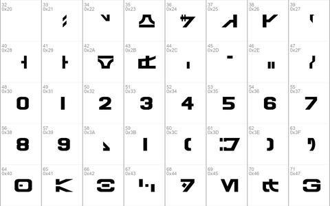
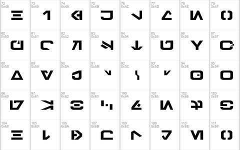
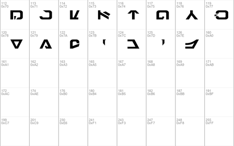
Download free Galactic Basic font - Free fonts download
lettering created by West End Games. My focus has been to accurately
populate this font with letters that are seen in the movies of the
original trilogy. After close examination of screenshots and officially
available information, many letters have been revised or replaced.
Letters that do not appear in the trilogy were replaced. These include:
Grek, Jenth, Osk, and Resh. (If you don't know what any of these letter
names mean, don't worry about it; this info is for the Aurebesh
purists.) Grek has been replaced with a modified version of Enth. Osk
has been replaced with Orenth. Resh has been replaced by Nen. Jenth has
been replaced with an entirely new letter, which I refer to as Jul. All
other letters have been severely modified for accuracy. Arabic numerals
(1,2,3, etc) have been used in the font, since Arabic numerals were used
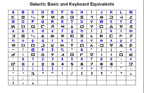
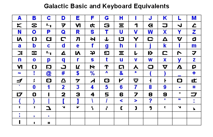
in the original trilogy. See the attached galbasic_table.gif for a full
table of Galactic Basic letters and their respective keys.
NOTE: This font is simply a personal interpretation. It will not allow
you to translate anything seen in the movies. I apologize if your
favorite letters have been changed or removed.
Source: http://erikstormtrooper.com/galacticbasic.htm
Download font
Free for Personal Use
This fonts are authors' property, and are either shareware, demo versions or public domain. The licence mentioned above the download button is just an indication. Please look at the readme-files in the archives or check the indicated author's website for details, and contact him if in doubt. If no author/licence is indicated that's because we don't have information, that doesn't mean it's free.
Galactic Basic Regular | GalacticBasic-rznB.ttf
- Font family: Galactic Basic
- Font subfamily identification: Regular
- Unique identifier: Erikstormtrooper's Galactic Basic
- Full font name: Galactic Basic
- Version: 1. 1 - Oct 08, 2002
- Postscript font name: Galactic Basic
galbasic_readme
GALACTIC BASIC
Macintosh & Windows TrueType Font
Created by ErikStormtrooper.com
--------------------------------------------------
ORIGIN OF THIS FONT
This font is based on - but differs slightly from - the Aurebesh
lettering created by West End Games. My focus has been to accurately
populate this font with letters that are seen in the movies of the
original trilogy. After close examination of screenshots and officially
available information, many letters have been revised or replaced.
Letters that do not appear in the trilogy were replaced. These include:
Grek, Jenth, Osk, and Resh. (If you don't know what any of these letter
names mean, don't worry about it; this info is for the Aurebesh
purists.) Grek has been replaced with a modified version of Enth. Osk
has been replaced with Orenth. Resh has been replaced by Nen. Jenth has
been replaced with an entirely new letter, which I refer to as Jul. All
other letters have been severely modified for accuracy. Arabic numerals
(1,2,3, etc) have been used in the font, since Arabic numerals were used
in the original trilogy. See the attached galbasic_table.gif for a full
table of Galactic Basic letters and their respective keys.
NOTE: This font is simply a personal interpretation. It will not allow
you to translate anything seen in the movies. I apologize if your
favorite letters have been changed or removed.
--------------------------------------------------
USE OF THIS FONT
IMPORTANT: There are two distinct sets of letters in this font -
uppercase and lowercase (see galbasic_cases.gif). Uppercase letters are
"rightside up" letters, resembling the familiar Aurebesh. Lowercase
letters are upside down (rotated 180 degrees) versions of their
uppercase counterparts. This was done so you can create upside-down
words, which often appear on screen. To recreate movie-accurate text,
uppercase and lowercase should not be mixed on the same line, and you
should not use capital letters with lowercase. If you're simply looking
for visually appealing letter combinations, mixing upper and lowercase
can be quite effective (see galbasic_mixedcases.gif).
REDUCING SPACES BETWEEN LETTERS
Because of the shapes of many of the letters, unsightly spaces have a
tendency to form in the middle of words. To correct for this, I have
adjusted the kerning for many of the letters so that they fit more
closely together. This kerning is not automatic however; it must be
turned on in the text program you are using. For example, to enable
kerning in Word, select Format, Font, Character Spacing, then enable
"kerning for fonts". See galbasic_kerning.gif for an example of words
with and without kerning.
--------------------------------------------------
LEGAL MUMBO JUMBO
This font is not officially licensed and is not intended to infringe on
any copyright. This font is freeware; it may be distributed freely, but
PLEASE distribute all files included in the ZIP archive. This font is
NOT to be sold or used for financial gain. Help keep it free and
available!
info
license: Freeware
link: https://www.fontspace.com/galactic-basic-font-f37907
Comments (0)
By Free fonts download
Madelina Script fontPersonal Use Free
Brother Lands fontPersonal Use Free
Southampton fontPersonal Use Free
Lastest fonts
Scream Thing fontPersonal Use Free
Mendward fontPersonal Use Free
Ballpoint fontPersonal Use Free
SMART HELLO fontPersonal Use Free
BOOK LINE fontPersonal Use Free
Syukury fontPersonal Use Free
Kayalla fontPersonal Use Free
Agathsya fontPersonal Use Free
Fenix Sans fontPersonal Use Free
Gorva-Demo fontPersonal Use Free
Montreau fontPersonal Use Free
Piazzolla Thin fontPersonal Use Free

