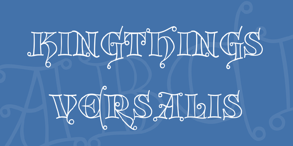
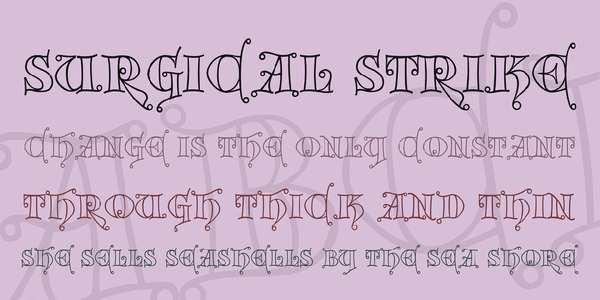
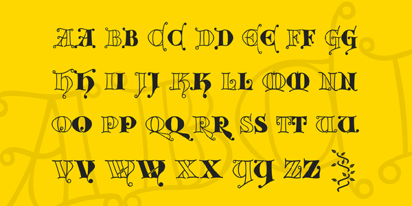
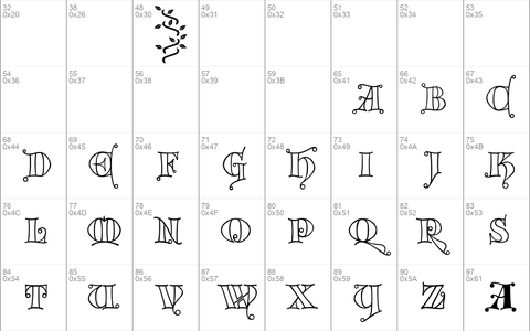
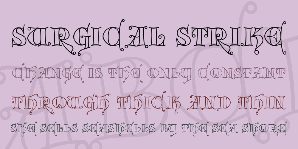
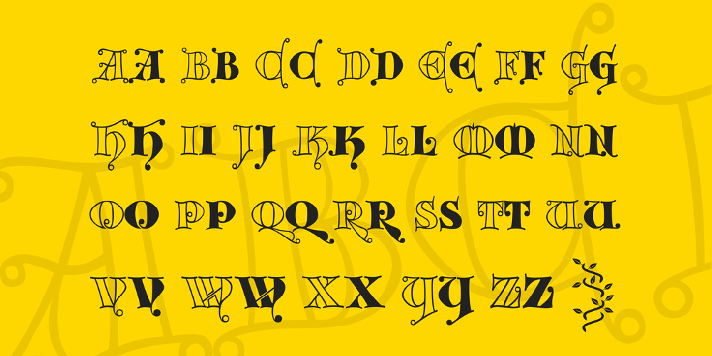
Download free Kingthings Versalis font - Free fonts download

Download font
Free for Personal Use
This fonts are authors' property, and are either shareware, demo versions or public domain. The licence mentioned above the download button is just an indication. Please look at the readme-files in the archives or check the indicated author's website for details, and contact him if in doubt. If no author/licence is indicated that's because we don't have information, that doesn't mean it's free.
Kingthings Versalis Regular | kingthings-versalis.regular.ttf
- Font family: Kingthings Versalis
- Font subfamily identification: Regular
- Unique identifier: Kingthings Versalis
- Full font name: Kingthings Versalis
- Version: Kingthings Versalis Version 1. 0
- Postscript font name: KingthingsVersalis
- Trademark notice: Kingthings Versalis, Copyright Kingthings 2004.
- Manufacturer name: kevinking@kingthings. freeserve. co. uk
- Designer: kevinking@kingthings. freeserve. co. uk
allfontsinfo
Hi! Thanks for reading my fonts Info file.
My currently available fonts and those in development are:
Kingthings Calligraphica
Kingthings Calligraphica Italic
Kingthings Calligraphica Light
Kingthings Xander
Kingthings Xander Outline
Kingthings Gothique
Kingthings Petrock
Kingthings Petrock Light
Kingthings Organica
Kingthings Hand
Kingthings Hand Light
Kingthings Kelltika
Kingthings Italique
Kingthings Chimaera
Kingthings Sans
Kingthings Whizzbang
Kingthings Annex
Kingthings Flourishes
Kingthings Linear K
Kingthings Printingkit
Kingthings Spike
Kingthings Trypewriter
Kingthings Wrote
Kingthings Xstitch
Kingthings Flashbang
Kingthings Poppalok
Kingthings Versalis
--------------------------------------------------------------------------------
Below, you will find some thoughts and information on my fonts. In no particular order they are...
--------------------------------------------------------------------------------
Kingthings Spike
It may never be finished! (although this will have to do for now). It is the most intractable face I have worked with (until I started Wrote!) - I try one thing and then everything else needs changing too - it is a major bugger! When I have calmed down it will get finished... probably. I made it originally because Buffy has her own font - (find it on the web called 'Buffied') - I made one for Xander - Spike is another small tribute to a fabulous show.
--------------------------------------------------------------------------------
Kingthings Trypewriter
Is taken from my old typewriter that now sits dusty unrepentant and snarling under the bed whilst various forms of word processor come and go - yes it is getting on for 90 years old, yes the sticky ribbons give me black fingers and spludgy letters. I love it - now you can share... You don�t get the grumbling, swearing or bruised fingers though.
--------------------------------------------------------------------------------
Kingthings Printing Kit
I had one as a child - Red rubber letters, and ink that was extremely unforgiving - Oooo she did get cross! Anyway, it was called 'The John Bull Printing Set' and I spent hours losing the letters, cutting fingers on sharp tweezers and trying to get the ink off the priceless antique lace tablecloth - sometimes I think I even printed things with it!
- This is a small homage. Oh and I like deconstruction too...
--------------------------------------------------------------------------------
Kingthings Wrote
It will be finished one day! After making Kingthings Hand - which was supposed to be informal and flowing - and turned out completely different - they do that, fonts, like wayward children; I wanted to make a font of my handwriting that I could use for notes � I tried once before and came up with Kingthings hand which was far too formal � I am having considerable problems getting this one to work - as ever the more free and flowing a font needs to be, the more formal work it takes to make it useable. I�m working on it OK? Sort of... Pook!
--------------------------------------------------------------------------------
Kingthings Annex
Obviously based on Kingthings Organica. Annex Lives in the Annex and signs everything Annex, She is a real Earth Mother type - bless her, and constantly plants, fails to water and swears at, and then paints and draws flowers. I love her deeply - so this font is for her.
--------------------------------------------------------------------------------
Kingthings Calligraphica Italic
This is based on Kingthings Calligraphica, I don't like the way that some fonts turn out when 'italicised' by word et al, so I thought that I would make a 'real' italic - it took more doing than I thought it would.
--------------------------------------------------------------------------------
Kingthings Calligraphica Light.
It is based on Kingthings Calligraphica. I made it because people feeding back from my website and from using my fonts asked for a lighter version - in much the same way as Petrock Light came about in fact! Also I have noticed that my 'normal' weight fonts tend to be on the heavy side - so Light!
---------------------------------------------------------------------------------
Kingthings Calligraphica
is based on calligraphic lettering hands which I learned at school - a bit of a confusion of different forms that I liked. I now use this letterform for most of the hand calligraphy that I still produce - just works for me - never can remember the uppercase 'N' though...
---------------------------------------------------------------------------------
Kingthings Flourishes
This is not a font, it was made to go with my fonts Petrock and Calligraphica - you will need to use a graphics program like Serif Page/Draw Plus or Paint Shop Pro (etc) to use it - oh, and character map - to see which flourish is which - as they are mapped to random letters - no I don't know which ones!
---------------------------------------------------------------------------------
Kingthings Gothique.
Is based on Kingthings Xander, again it was Anne's prompting that led to this font, she said
"You know, I can't find any fonts that are really different" to use for my Oxfam posters (although a little of this font goes a long way!) Finally I was very pleased with this font, one of my favourites.
---------------------------------------------------------------------------------
Kingthings Hand and Hand Light
This is based, arrogantly on my own hand writing, when writing up course notes, I thought � hmm, could use voice recognition and a handwriting font... sad really. Then it got sadder 'cos I was asked for something not so bold - although the light version may end up as the normal weight - later!
----------------------------------------------------------------------------------
Kingthings Italique.
Again this is based on a calligraphic hand that I evolved from those I learned at school. I wanted to do this one just for me as I like the spiky look of it when set as solid text.
----------------------------------------------------------------------------------
Kingthings Kelltika.
This is based on characters from the Book of Kells and other calligraphic works. I wanted to make a font based on these letter forms for a long time - it has taken me a while to get it right and I'm afraid that it is subject to change at a whim - as are all my fonts! There are no real capital letters in the documents that I have been working from, so I have, as there, enlarged the lower case, dropped the base line and decorated them. The decorations really need to be larger than 36pt to show up.
----------------------------------------------------------------------------------
Kingthings Linear K.
I wanted to make a font with the simplest possible forms that I could use over and over again in font creator - like stick drawings - just lines, hence linear. I may come back to it - haven�t really worked out where I want it to go - and it hasn�t expressed a preference... Looks nasty though which is always a start!
----------------------------------------------------------------------------------
Kingthings Organica.
Was originally developed at Art College in 1981 - at the time it was called Roxanne and was hand drawn at an X height of about 4 inches � took weeks and weeks! Fun though. Finally made into a proper font � sorry to all those who downloaded it before I had tidied it up - but then I do change all of them at a mere whim...
----------------------------------------------------------------------------------
Kingthings Petrock and Petrock Light.
These are based on a labelling face I found used in a tiny city church in central Exeter - it was in a display case regarding bell ringing. The light font was designed to make Kingthings Petrock more useable, and may end up as an Italic too. It has had some modification to make it suitable as a Windows font but retains most of the flavour of the original.
----------------------------------------------------------------------------------
Kingthings Sans.
I made this font because I fancied designing a font that was definitely Sans Serif but had fiddly bits and was more decorative. It is based on Kingthings Hand. Yes, I agree, it is peculiar... I like peculiar! If you like peculiar too � take a look at Kingthings Chimaera, it�s based on this font.
----------------------------------------------------------------------------------
Kingthings Xander and Xander Outline.
Both are based on a pen built form that I doodled when watching Telly - must say something about my telly choices! These doodles turned into Kingthings Xander and then Anne suggested an outline form because she can't find one she likes - so here it is. It has undergone several changes since then mainly due to email feedback.
-----------------------------------------------------------------------------------
Kingthings Poppalok.
This is based on Kingthings Whizzbang � it is actually Anthea�s fault � if you want someone to blame, (and it never hurts), she said, when I showed her whizzbang, �Oh yes, reminds me of those beads you used to get, years ago� � Poppalok beads, I played with them for hours when I was a child � Mum had them in all colours, and some very strange combinations when I had finished!
------------------------------------------------------------------------------------
Kingthings Flashbang.
This font is, again based on Kingthings Whizzbang � I enjoyed making it so much that I only occasionally had time to wonder why The Font Creator Program was struggling � it's about ten times the size of a �normal� font. This is because fonts are made up of individual bits called glyphs � there are just rather a lot of them...
-----------------------------------------------------------------------------------
Kingthings Xstitch.
I just made this font because I wanted one for a project I was working on and couldn't find one - of course, since then, kind souls have found several for me... Well this one is mine and did what I wanted it for - I do like the Ray Larabie one though...
-----------------------------------------------------------------------------------
I am constantly working on all my fonts so these may well not be the last versions, please check back to Font Freak and also check my own website at:
http://mysite.freeserve.com/Kingthings/index.htm
I hope you enjoy using my fonts and I would appreciate any feedback from you regarding missing characters, things that would be useful, bits that don't work and so on. Also, please let me know if you have downloaded it for use on a Mac - I have had some reports of Mac versions not working... Please email me at:
[email protected]
--------------------------------------------------------------------------------------------------
Thank you
Regards
Kevin King
Exeter, England - September 2004
kingthingsEULA
Kingthings EULA - (End User License Agreement).
All the fonts currently published on my website (www.kingthingsfonts.co.uk) are free for you to use for any purpose you wish. Please do not change my original font files (.TTF).
There are some paid-for versions of my fonts (with much enhanced character sets) available from to buy from www.cheapprofonts.com, these contain their own EULA and are not included or implied in this notice.
Please enjoy all your creative work - and if you come up with anything you like, I would appreciate a picture.
Regards
Kevin King
Exeter, England - February 2009
Comments (0)
By Free fonts download
Madelina Script fontPersonal Use Free
Brother Lands fontPersonal Use Free
Southampton fontPersonal Use Free
Lastest fonts
RODRUP fontPersonal Use Free
milda fontPersonal Use Free
Good Vibrations fontPersonal Use Free
Typo Oval Demo fontPersonal Use Free
Watermelon Family fontPersonal Use Free
Dark Crow Italic PERSONAL USE fontPersonal Use Free
Thuner fontPersonal Use Free
Think fontPersonal Use Free
Sachi Sans DEMO fontPersonal Use Free
Caligna DEMO fontPersonal Use Free
Ragila fontPersonal Use Free
Copperplate CC fontPersonal Use Free

