Font CategoriesSans serif

Download free Lato font - Free fonts download

(0 vote)
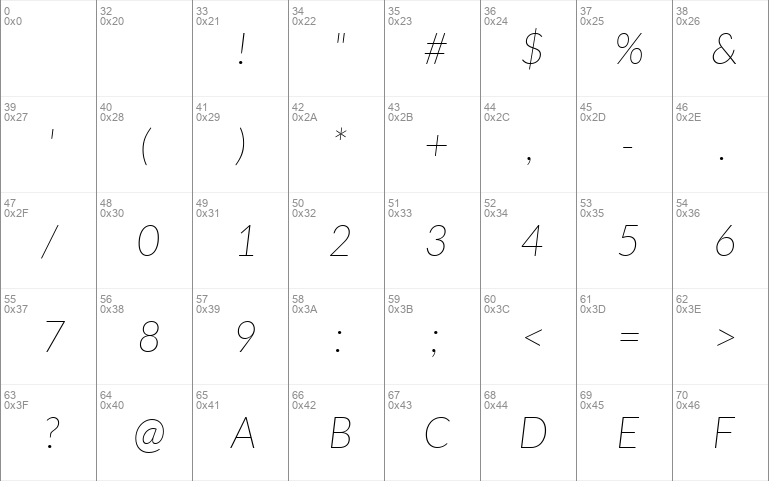
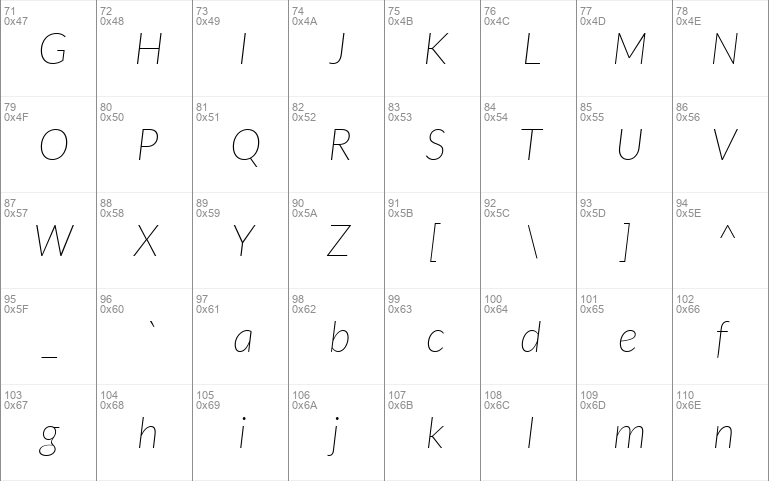
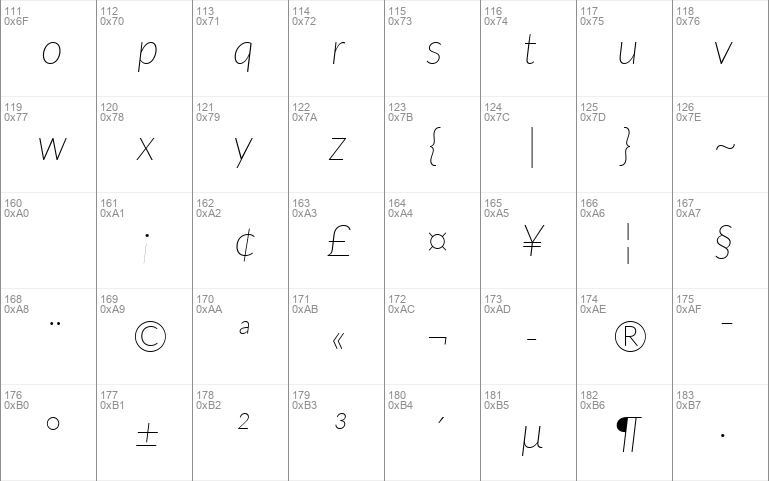
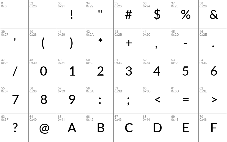
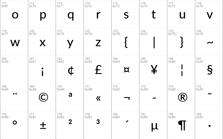
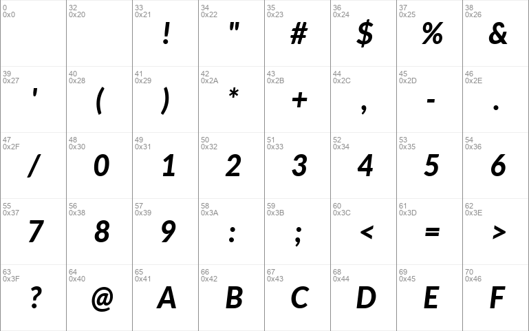
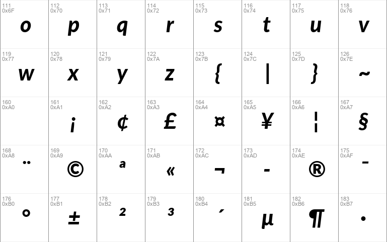
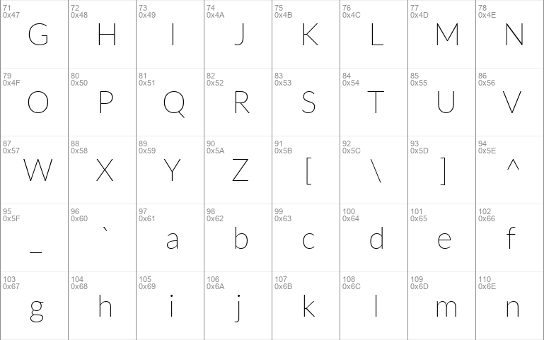
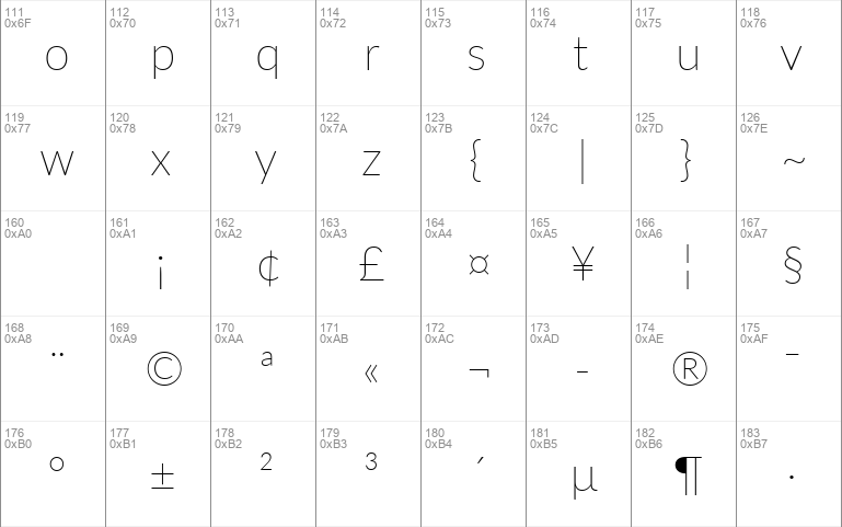
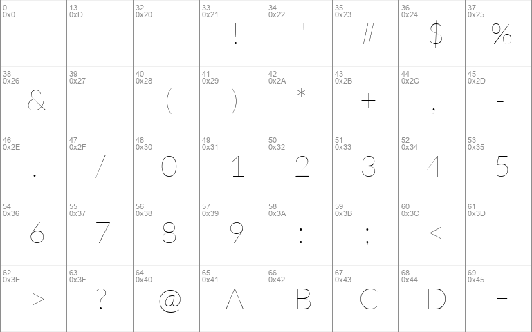
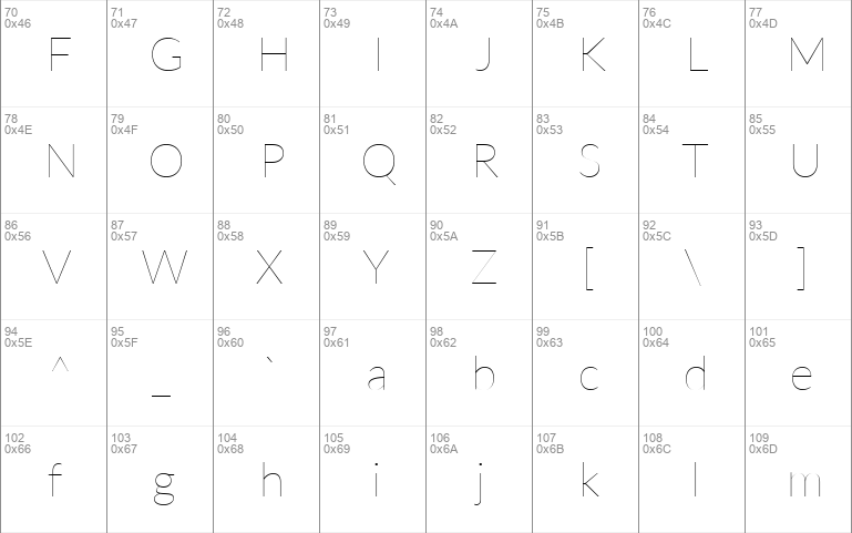
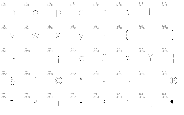
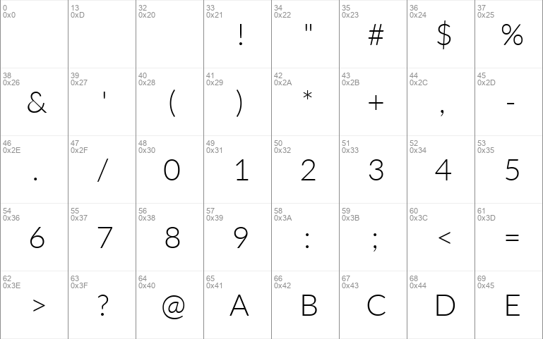
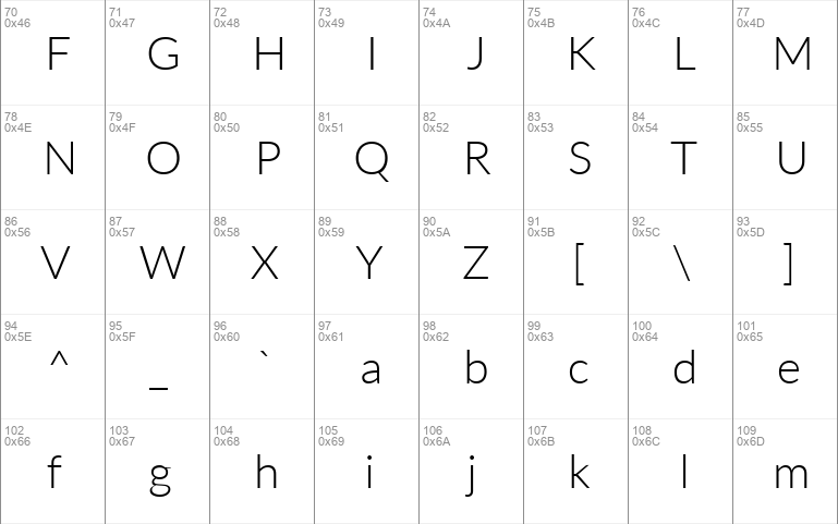
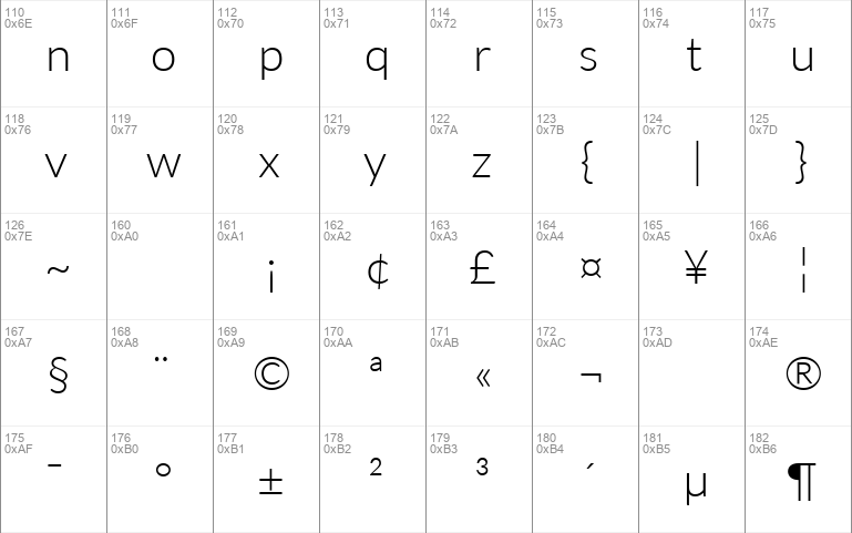
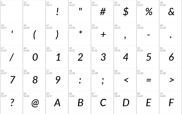
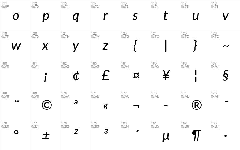
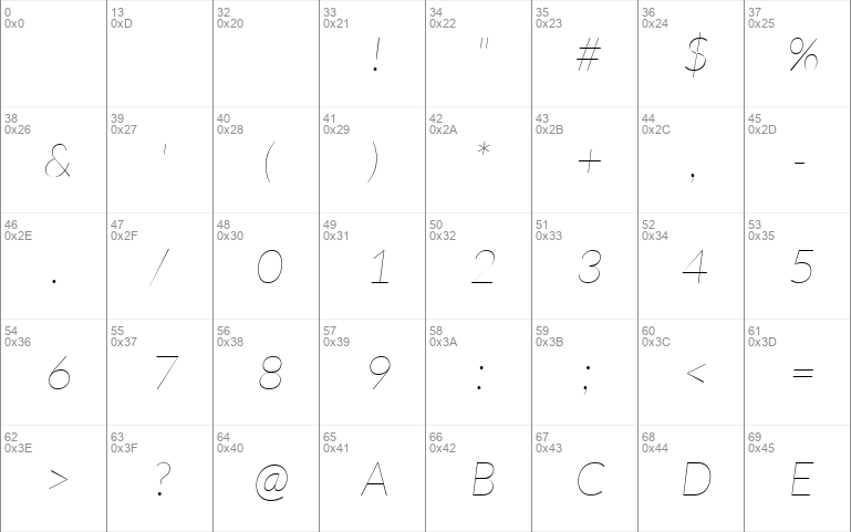
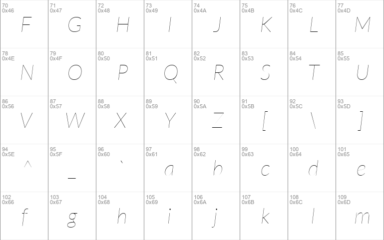
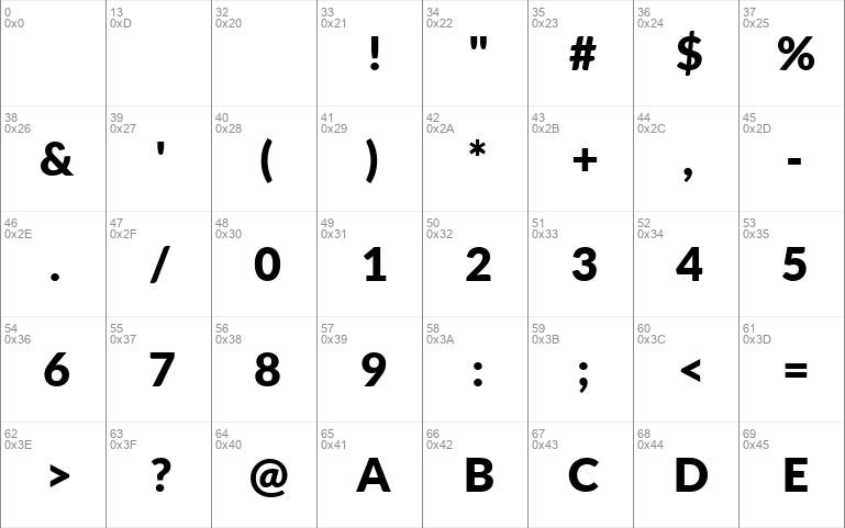
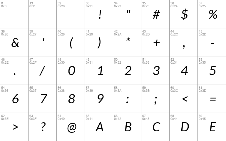
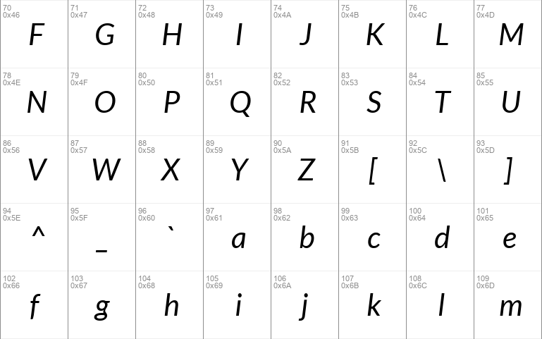
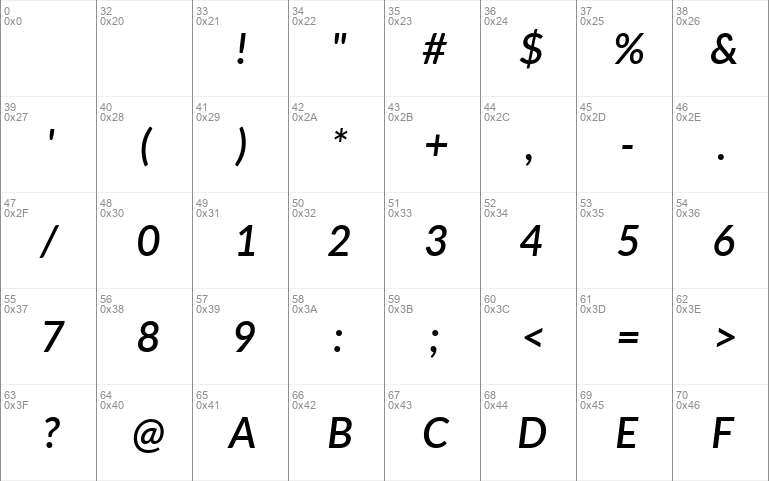
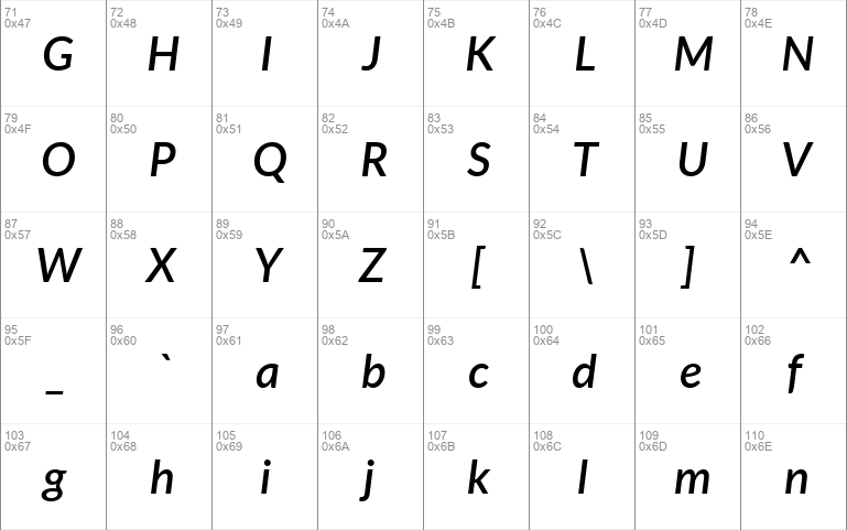
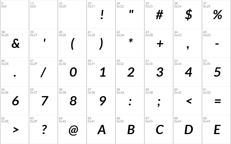
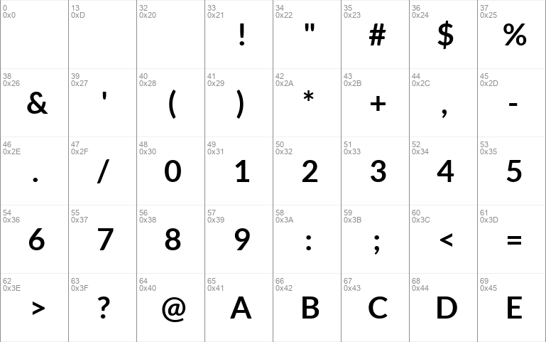
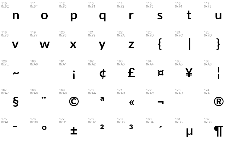
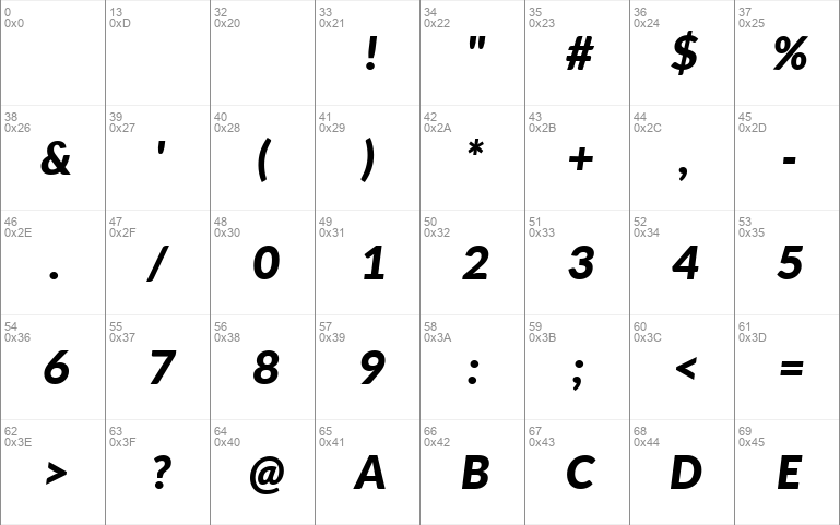
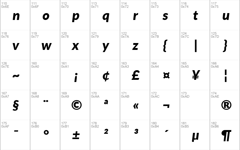
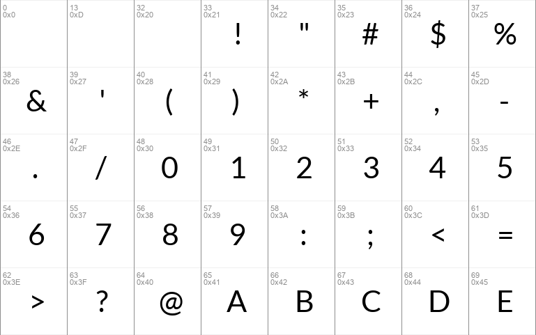
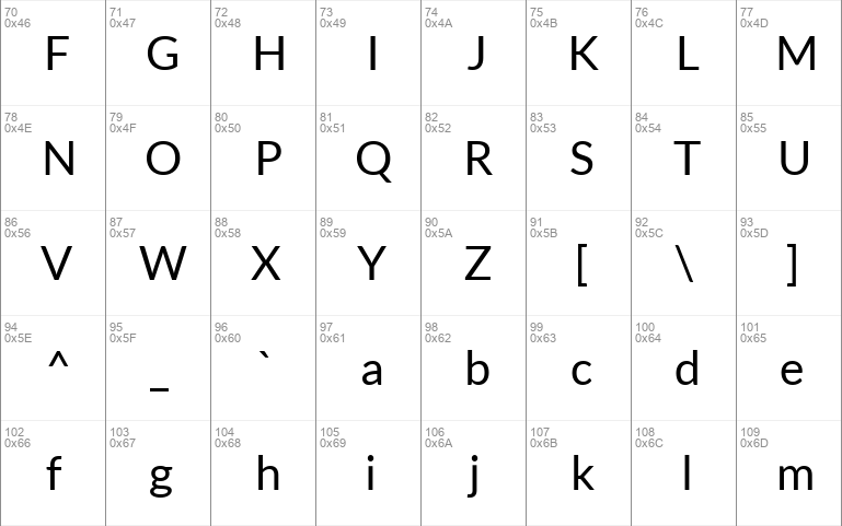
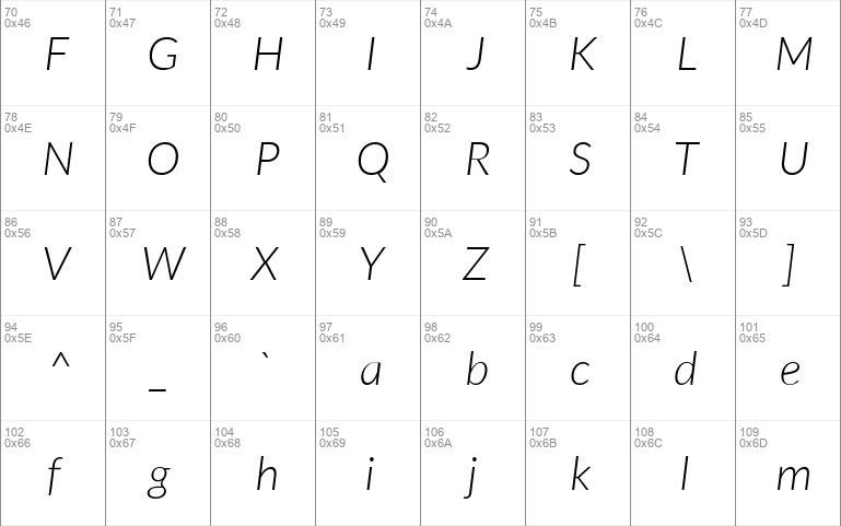
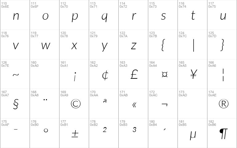
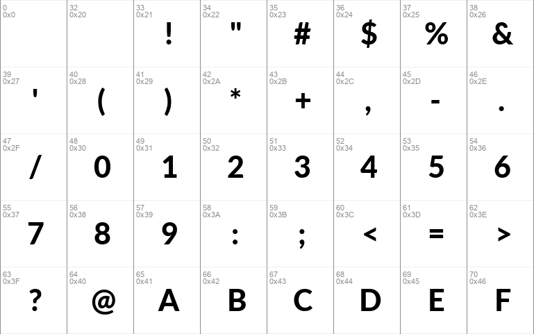
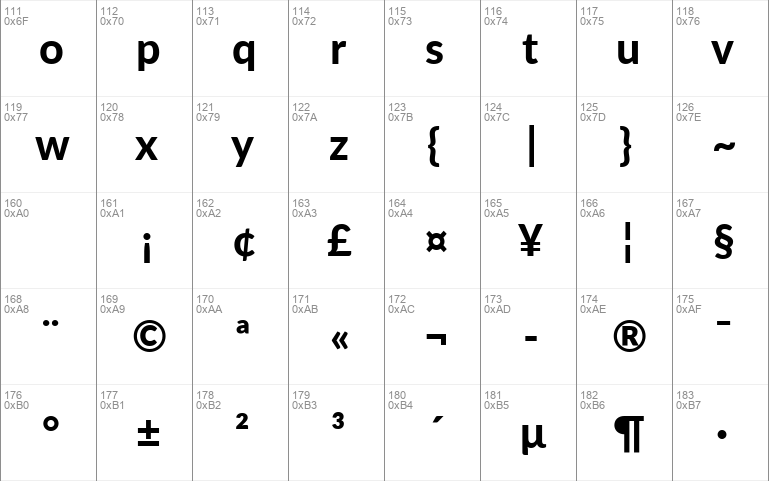
Download free Lato font by Free fonts download free for Personal Use. Font list styles: Lato-ThinItalic.ttf, Lato-Medium.ttf, Lato-HeavyItalic.ttf, Lato-Thin.ttf, Lato-Hairline.ttf, Lato-Light.ttf, Lato-MediumItalic.ttf, Lato-HairlineItalic.ttf, Lato-Black.ttf, Lato-Italic.ttf, Lato-SemiboldItalic.ttf, Lato-BoldItalic.ttf, Lato-Bold.ttf, Lato-BlackItalic.ttf, Lato-Regular.ttf, Lato-LightItalic.ttf, Lato-Heavy.ttf,
  • Lato Thin Italic
  • Lato Thin Italic
  • Lato Thin Italic
  • Lato Medium
  • Lato Medium
  • Lato Medium
  • Lato Heavy Italic
  • Lato Heavy Italic
  • Lato Heavy Italic
  • Lato Thin
  • Lato Thin
  • Lato Thin
  • Lato Hairline
  • Lato Hairline
  • Lato Hairline
  • Lato Light
  • Lato Light
  • Lato Light
  • Lato Medium Italic
  • Lato Medium Italic
  • Lato Medium Italic
  • Lato Hairline Italic
  • Lato Hairline Italic
  • Lato Hairline Italic
  • Lato Black
  • Lato Black
  • Lato Black
  • Lato Italic
  • Lato Italic
  • Lato Italic
  • Lato Semibold Italic
  • Lato Semibold Italic
  • Lato Semibold Italic
  • Lato Bold Italic
  • Lato Bold Italic
  • Lato Bold Italic
  • Lato Bold
  • Lato Bold
  • Lato Bold
  • Lato Black Italic
  • Lato Black Italic
  • Lato Black Italic
  • Lato Regular
  • Lato Regular
  • Lato Regular
  • Lato Light Italic
  • Lato Light Italic
  • Lato Light Italic
  • Lato Heavy
  • Lato Heavy
  • Lato Heavy

Download font

Free for Personal Use

This fonts are authors' property, and are either shareware, demo versions or public domain. The licence mentioned above the download button is just an indication. Please look at the readme-files in the archives or check the indicated author's website for details, and contact him if in doubt. If no author/licence is indicated that's because we don't have information, that doesn't mean it's free.

AA Aa aa
  • Lato Thin Italic Lato-ThinItalic.ttf
    Lato Thin Italic font - Lato-ThinItalic.ttf
  • Lato Medium Lato-Medium.ttf
    Lato Medium font - Lato-Medium.ttf
  • Lato Heavy Italic Lato-HeavyItalic.ttf
    Lato Heavy Italic font - Lato-HeavyItalic.ttf
  • Lato Thin Lato-Thin.ttf
    Lato Thin font - Lato-Thin.ttf
  • Lato Hairline Lato-Hairline.ttf
    Lato Hairline font - Lato-Hairline.ttf
  • Lato Light Lato-Light.ttf
    Lato Light font - Lato-Light.ttf
  • Lato Medium Italic Lato-MediumItalic.ttf
    Lato Medium Italic font - Lato-MediumItalic.ttf
  • Lato Hairline Italic Lato-HairlineItalic.ttf
    Lato Hairline Italic font - Lato-HairlineItalic.ttf
  • Lato Black Lato-Black.ttf
    Lato Black font - Lato-Black.ttf
  • Lato Italic Lato-Italic.ttf
    Lato Italic font - Lato-Italic.ttf
  • Lato Semibold Italic Lato-SemiboldItalic.ttf
    Lato Semibold Italic font - Lato-SemiboldItalic.ttf
  • Lato Bold Italic Lato-BoldItalic.ttf
    Lato Bold Italic font - Lato-BoldItalic.ttf
  • Lato Bold Lato-Bold.ttf
    Lato Bold font - Lato-Bold.ttf
  • Lato Black Italic Lato-BlackItalic.ttf
    Lato Black Italic font - Lato-BlackItalic.ttf
  • Lato Regular Lato-Regular.ttf
    Lato Regular font - Lato-Regular.ttf
  • Lato Light Italic Lato-LightItalic.ttf
    Lato Light Italic font - Lato-LightItalic.ttf
  • Lato Heavy Lato-Heavy.ttf
    Lato Heavy font - Lato-Heavy.ttf

Lato Thin Italic | Lato-ThinItalic.ttf

  • Font family: Lato
  • Font subfamily identification: Thin Italic
  • Unique identifier: tyPoland Lukasz Dziedzic:Lato Thin Italic:2014
  • Full font name: Lato Thin Italic
  • Version: Version 2. 015; 2015-08-06; http:www. latofonts. com
  • Postscript font name: Lato-ThinItalic
  • Trademark notice: Lato is a trademark of tyPoland Lukasz Dziedzic.
  • Manufacturer name: tyPoland Lukasz Dziedzic
  • Designer: Lukasz Dziedzic with Adam Twardoch and Botio Nikoltchev
  • Description: Lato is a sanserif typeface family designed in the Summer 2010 and extended in the Summer 2013 by Warsaw-based designer Lukasz Dziedzic "Lato " means "Summer " in Polish. It tries to carefully balance some potentially conflicting priorities: it should seem quite "transparent " when used in body text but would display some original traits when used in larger sizes. The classical proportions, particularly visible in the uppercase, give the letterforms familiar harmony and elegance. At the same time, its sleek sanserif look makes evident the fact that Lato was designed in the 2010s, even though it does not follow any current trend. The semi-rounded details of the letters give Lato a feeling of warmth, while the strong structure provides stability and seriousness. In 2013-2014, the family was greatly extended with the help of Adam Twardoch and Botio Nikoltchev to cover 3000+ glyphs over nine weights with italics. It now supports 100+ Latin-based languages, 50+ Cyrillic-based languages as well as Greek and IPA phonetics. The Lato fonts are available free of charge under the SIL Open Font License from http:www. latofonts. com
  • License: Copyright c 2011-2015 by tyPoland Lukasz Dziedzic http:www. typoland. com with Reserved Font Name "Lato ". Licensed under the SIL Open Font License, Version 1. 1 http:scripts. sil. orgOFL.

Lato Medium | Lato-Medium.ttf

  • Font family: Lato
  • Font subfamily identification: Medium
  • Unique identifier: tyPoland Lukasz Dziedzic:Lato Medium:2014
  • Full font name: Lato Medium
  • Version: Version 2. 010; 2014-09-01; http:www. latofonts. com
  • Postscript font name: Lato-Medium
  • Trademark notice: Lato is a trademark of tyPoland Lukasz Dziedzic.
  • Manufacturer name: tyPoland Lukasz Dziedzic
  • Designer: Lukasz Dziedzic with Adam Twardoch and Botio Nikoltchev
  • Description: Lato is a sanserif typeface family designed in the Summer 2010 and extended in the Summer 2013 by Warsaw-based designer Lukasz Dziedzic "Lato " means "Summer " in Polish. It tries to carefully balance some potentially conflicting priorities: it should seem quite "transparent " when used in body text but would display some original traits when used in larger sizes. The classical proportions, particularly visible in the uppercase, give the letterforms familiar harmony and elegance. At the same time, its sleek sanserif look makes evident the fact that Lato was designed in the 2010s, even though it does not follow any current trend. The semi-rounded details of the letters give Lato a feeling of warmth, while the strong structure provides stability and seriousness. In 2013-2014, the family was greatly extended with the help of Adam Twardoch and Botio Nikoltchev to cover 3000+ glyphs over nine weights with italics. It now supports 100+ Latin-based languages, 50+ Cyrillic-based languages as well as Greek and IPA phonetics. The Lato fonts are available free of charge under the SIL Open Font License from http:www. latofonts. com
  • License: Copyright c 2011-2014 by tyPoland Lukasz Dziedzic http:www. typoland. com with Reserved Font Name "Lato ". Licensed under the SIL Open Font License, Version 1. 1 http:scripts. sil. orgOFL.

Lato Heavy Italic | Lato-HeavyItalic.ttf

  • Font family: Lato
  • Font subfamily identification: Heavy Italic
  • Unique identifier: tyPoland Lukasz Dziedzic:Lato Heavy Italic:2014
  • Full font name: Lato Heavy Italic
  • Version: Version 2. 010; 2014-09-01; http:www. latofonts. com
  • Postscript font name: Lato-HeavyItalic
  • Trademark notice: Lato is a trademark of tyPoland Lukasz Dziedzic.
  • Manufacturer name: tyPoland Lukasz Dziedzic
  • Designer: Lukasz Dziedzic with Adam Twardoch and Botio Nikoltchev
  • Description: Lato is a sanserif typeface family designed in the Summer 2010 and extended in the Summer 2013 by Warsaw-based designer Lukasz Dziedzic "Lato " means "Summer " in Polish. It tries to carefully balance some potentially conflicting priorities: it should seem quite "transparent " when used in body text but would display some original traits when used in larger sizes. The classical proportions, particularly visible in the uppercase, give the letterforms familiar harmony and elegance. At the same time, its sleek sanserif look makes evident the fact that Lato was designed in the 2010s, even though it does not follow any current trend. The semi-rounded details of the letters give Lato a feeling of warmth, while the strong structure provides stability and seriousness. In 2013-2014, the family was greatly extended with the help of Adam Twardoch and Botio Nikoltchev to cover 3000+ glyphs over nine weights with italics. It now supports 100+ Latin-based languages, 50+ Cyrillic-based languages as well as Greek and IPA phonetics. The Lato fonts are available free of charge under the SIL Open Font License from http:www. latofonts. com
  • License: Copyright c 2011-2014 by tyPoland Lukasz Dziedzic http:www. typoland. com with Reserved Font Name "Lato ". Licensed under the SIL Open Font License, Version 1. 1 http:scripts. sil. orgOFL.

Lato Thin | Lato-Thin.ttf

  • Font family: Lato
  • Font subfamily identification: Thin
  • Unique identifier: tyPoland Lukasz Dziedzic:Lato Thin:2014
  • Full font name: Lato Thin
  • Version: Version 2. 010; 2014-09-01; http:www. latofonts. com
  • Postscript font name: Lato-Thin
  • Trademark notice: Lato is a trademark of tyPoland Lukasz Dziedzic.
  • Manufacturer name: tyPoland Lukasz Dziedzic
  • Designer: Lukasz Dziedzic with Adam Twardoch and Botio Nikoltchev
  • Description: Lato is a sanserif typeface family designed in the Summer 2010 and extended in the Summer 2013 by Warsaw-based designer Lukasz Dziedzic "Lato " means "Summer " in Polish. It tries to carefully balance some potentially conflicting priorities: it should seem quite "transparent " when used in body text but would display some original traits when used in larger sizes. The classical proportions, particularly visible in the uppercase, give the letterforms familiar harmony and elegance. At the same time, its sleek sanserif look makes evident the fact that Lato was designed in the 2010s, even though it does not follow any current trend. The semi-rounded details of the letters give Lato a feeling of warmth, while the strong structure provides stability and seriousness. In 2013-2014, the family was greatly extended with the help of Adam Twardoch and Botio Nikoltchev to cover 3000+ glyphs over nine weights with italics. It now supports 100+ Latin-based languages, 50+ Cyrillic-based languages as well as Greek and IPA phonetics. The Lato fonts are available free of charge under the SIL Open Font License from http:www. latofonts. com
  • License: Copyright c 2011-2014 by tyPoland Lukasz Dziedzic http:www. typoland. com with Reserved Font Name "Lato ". Licensed under the SIL Open Font License, Version 1. 1 http:scripts. sil. orgOFL.

Lato Hairline | Lato-Hairline.ttf

  • Font family: Lato
  • Font subfamily identification: Hairline
  • Unique identifier: tyPoland LukaszDziedzic: Lato Light Italic: 2010
  • Full font name: Lato Hairline
  • Version: Version 1. 010; Western character set
  • Postscript font name: Lato-Hairline
  • Trademark notice: Lato is a trademark of tyPoland Lukasz Dziedzic.
  • Manufacturer name: tyPoland Lukasz Dziedzic
  • Designer: Lukasz Dziedzic
  • Description: Lato is a sanserif typeface family designed in the Summer 2010 by Warsaw-based designer Lukasz Dziedzic "Lato " means "Summer " in Polish. It tries to carefully balance some potentially conflicting priorities: it should seem quite "transparent " when used in body text but would display some original traits when used in larger sizes. The classical proportions, particularly visible in the uppercase, give the letterforms familiar harmony and elegance. At the same time, its sleek sanserif look makes evident the fact that Lato was designed in 2010, even though it does not follow any current trend. The semi-rounded details of the letters give Lato a feeling of warmth, while the strong structure provides stability and seriousness.
  • License: Copyright c 2010 by tyPoland Lukasz Dziedzic http:www. typoland. com with Reserved Font Name "Lato ". Licensed under the SIL Open Font License, Version 1. 1 http:scripts. sil. orgOFL.

Lato Light | Lato-Light.ttf

  • Font family: Lato
  • Font subfamily identification: Light
  • Unique identifier: tyPoland LukaszDziedzic: Lato Light: 2010
  • Full font name: Lato Light
  • Version: Version 1. 010; Western character set
  • Postscript font name: Lato-Light
  • Trademark notice: Lato is a trademark of tyPoland Lukasz Dziedzic.
  • Manufacturer name: tyPoland Lukasz Dziedzic
  • Designer: Lukasz Dziedzic
  • Description: Lato is a sanserif typeface family designed in the Summer 2010 by Warsaw-based designer Lukasz Dziedzic "Lato " means "Summer " in Polish. It tries to carefully balance some potentially conflicting priorities: it should seem quite "transparent " when used in body text but would display some original traits when used in larger sizes. The classical proportions, particularly visible in the uppercase, give the letterforms familiar harmony and elegance. At the same time, its sleek sanserif look makes evident the fact that Lato was designed in 2010, even though it does not follow any current trend. The semi-rounded details of the letters give Lato a feeling of warmth, while the strong structure provides stability and seriousness.
  • License: Copyright c 2010 by tyPoland Lukasz Dziedzic http:www. typoland. com with Reserved Font Name "Lato ". Licensed under the SIL Open Font License, Version 1. 1 http:scripts. sil. orgOFL.

Lato Medium Italic | Lato-MediumItalic.ttf

  • Font family: Lato
  • Font subfamily identification: Medium Italic
  • Unique identifier: tyPoland Lukasz Dziedzic:Lato Medium Italic:2014
  • Full font name: Lato Medium Italic
  • Version: Version 2. 010; 2014-09-01; http:www. latofonts. com
  • Postscript font name: Lato-MediumItalic
  • Trademark notice: Lato is a trademark of tyPoland Lukasz Dziedzic.
  • Manufacturer name: tyPoland Lukasz Dziedzic
  • Designer: Lukasz Dziedzic with Adam Twardoch and Botio Nikoltchev
  • Description: Lato is a sanserif typeface family designed in the Summer 2010 and extended in the Summer 2013 by Warsaw-based designer Lukasz Dziedzic "Lato " means "Summer " in Polish. It tries to carefully balance some potentially conflicting priorities: it should seem quite "transparent " when used in body text but would display some original traits when used in larger sizes. The classical proportions, particularly visible in the uppercase, give the letterforms familiar harmony and elegance. At the same time, its sleek sanserif look makes evident the fact that Lato was designed in the 2010s, even though it does not follow any current trend. The semi-rounded details of the letters give Lato a feeling of warmth, while the strong structure provides stability and seriousness. In 2013-2014, the family was greatly extended with the help of Adam Twardoch and Botio Nikoltchev to cover 3000+ glyphs over nine weights with italics. It now supports 100+ Latin-based languages, 50+ Cyrillic-based languages as well as Greek and IPA phonetics. The Lato fonts are available free of charge under the SIL Open Font License from http:www. latofonts. com
  • License: Copyright c 2011-2014 by tyPoland Lukasz Dziedzic http:www. typoland. com with Reserved Font Name "Lato ". Licensed under the SIL Open Font License, Version 1. 1 http:scripts. sil. orgOFL.

Lato Hairline Italic | Lato-HairlineItalic.ttf

  • Font family: Lato
  • Font subfamily identification: Hairline Italic
  • Unique identifier: tyPoland LukaszDziedzic: Lato Hairline Italic: 2010
  • Full font name: Lato Hairline Italic
  • Version: Version 1. 010; Western character set
  • Postscript font name: Lato-HairlineItalic
  • Trademark notice: Lato is a trademark of tyPoland Lukasz Dziedzic.
  • Manufacturer name: tyPoland Lukasz Dziedzic
  • Designer: Lukasz Dziedzic
  • Description: Lato is a sanserif typeface family designed in the Summer 2010 by Warsaw-based designer Lukasz Dziedzic "Lato " means "Summer " in Polish. It tries to carefully balance some potentially conflicting priorities: it should seem quite "transparent " when used in body text but would display some original traits when used in larger sizes. The classical proportions, particularly visible in the uppercase, give the letterforms familiar harmony and elegance. At the same time, its sleek sanserif look makes evident the fact that Lato was designed in 2010, even though it does not follow any current trend. The semi-rounded details of the letters give Lato a feeling of warmth, while the strong structure provides stability and seriousness.
  • License: Copyright c 2010 by tyPoland Lukasz Dziedzic http:www. typoland. com with Reserved Font Name "Lato ". Licensed under the SIL Open Font License, Version 1. 1 http:scripts. sil. orgOFL.

Lato Black | Lato-Black.ttf

  • Font family: Lato
  • Font subfamily identification: Black
  • Unique identifier: tyPoland LukaszDziedzic: Lato Black: 2010
  • Full font name: Lato Black
  • Version: Version 1. 010; Western character set
  • Postscript font name: Lato-Black
  • Trademark notice: Lato is a trademark of tyPoland Lukasz Dziedzic.
  • Manufacturer name: tyPoland Lukasz Dziedzic
  • Designer: Lukasz Dziedzic
  • Description: Lato is a sanserif typeface family designed in the Summer 2010 by Warsaw-based designer Lukasz Dziedzic "Lato " means "Summer " in Polish. It tries to carefully balance some potentially conflicting priorities: it should seem quite "transparent " when used in body text but would display some original traits when used in larger sizes. The classical proportions, particularly visible in the uppercase, give the letterforms familiar harmony and elegance. At the same time, its sleek sanserif look makes evident the fact that Lato was designed in 2010, even though it does not follow any current trend. The semi-rounded details of the letters give Lato a feeling of warmth, while the strong structure provides stability and seriousness.
  • License: Copyright c 2010 by tyPoland Lukasz Dziedzic http:www. typoland. com with Reserved Font Name "Lato ". Licensed under the SIL Open Font License, Version 1. 1 http:scripts. sil. orgOFL.

Lato Italic | Lato-Italic.ttf

  • Font family: Lato
  • Font subfamily identification: Italic
  • Unique identifier: tyPoland LukaszDziedzic: Lato Italic: 2010
  • Full font name: Lato Italic
  • Version: Version 1. 010; Western character set
  • Postscript font name: Lato-Italic
  • Trademark notice: Lato is a trademark of tyPoland Lukasz Dziedzic.
  • Manufacturer name: tyPoland Lukasz Dziedzic
  • Designer: Lukasz Dziedzic
  • Description: Lato is a sanserif typeface family designed in the Summer 2010 by Warsaw-based designer Lukasz Dziedzic "Lato " means "Summer " in Polish. It tries to carefully balance some potentially conflicting priorities: it should seem quite "transparent " when used in body text but would display some original traits when used in larger sizes. The classical proportions, particularly visible in the uppercase, give the letterforms familiar harmony and elegance. At the same time, its sleek sanserif look makes evident the fact that Lato was designed in 2010, even though it does not follow any current trend. The semi-rounded details of the letters give Lato a feeling of warmth, while the strong structure provides stability and seriousness.
  • License: Copyright c 2010 by tyPoland Lukasz Dziedzic http:www. typoland. com with Reserved Font Name "Lato ". Licensed under the SIL Open Font License, Version 1. 1 http:scripts. sil. orgOFL.

Lato Semibold Italic | Lato-SemiboldItalic.ttf

  • Font family: Lato
  • Font subfamily identification: Semibold Italic
  • Unique identifier: tyPoland Lukasz Dziedzic:Lato Semibold Italic:2014
  • Full font name: Lato Semibold Italic
  • Version: Version 2. 010; 2014-09-01; http:www. latofonts. com
  • Postscript font name: Lato-SemiboldItalic
  • Trademark notice: Lato is a trademark of tyPoland Lukasz Dziedzic.
  • Manufacturer name: tyPoland Lukasz Dziedzic
  • Designer: Lukasz Dziedzic with Adam Twardoch and Botio Nikoltchev
  • Description: Lato is a sanserif typeface family designed in the Summer 2010 and extended in the Summer 2013 by Warsaw-based designer Lukasz Dziedzic "Lato " means "Summer " in Polish. It tries to carefully balance some potentially conflicting priorities: it should seem quite "transparent " when used in body text but would display some original traits when used in larger sizes. The classical proportions, particularly visible in the uppercase, give the letterforms familiar harmony and elegance. At the same time, its sleek sanserif look makes evident the fact that Lato was designed in the 2010s, even though it does not follow any current trend. The semi-rounded details of the letters give Lato a feeling of warmth, while the strong structure provides stability and seriousness. In 2013-2014, the family was greatly extended with the help of Adam Twardoch and Botio Nikoltchev to cover 3000+ glyphs over nine weights with italics. It now supports 100+ Latin-based languages, 50+ Cyrillic-based languages as well as Greek and IPA phonetics. The Lato fonts are available free of charge under the SIL Open Font License from http:www. latofonts. com
  • License: Copyright c 2011-2014 by tyPoland Lukasz Dziedzic http:www. typoland. com with Reserved Font Name "Lato ". Licensed under the SIL Open Font License, Version 1. 1 http:scripts. sil. orgOFL.

Lato Bold Italic | Lato-BoldItalic.ttf

  • Font family: Lato
  • Font subfamily identification: Bold Italic
  • Unique identifier: tyPoland LukaszDziedzic: Lato Bold Italic: 2010
  • Full font name: Lato Bold Italic
  • Version: Version 1. 010; Western character set
  • Postscript font name: Lato-BoldItalic
  • Trademark notice: Lato is a trademark of tyPoland Lukasz Dziedzic.
  • Manufacturer name: tyPoland Lukasz Dziedzic
  • Designer: Lukasz Dziedzic
  • Description: Lato is a sanserif typeface family designed in the Summer 2010 by Warsaw-based designer Lukasz Dziedzic "Lato " means "Summer " in Polish. It tries to carefully balance some potentially conflicting priorities: it should seem quite "transparent " when used in body text but would display some original traits when used in larger sizes. The classical proportions, particularly visible in the uppercase, give the letterforms familiar harmony and elegance. At the same time, its sleek sanserif look makes evident the fact that Lato was designed in 2010, even though it does not follow any current trend. The semi-rounded details of the letters give Lato a feeling of warmth, while the strong structure provides stability and seriousness.
  • License: Copyright c 2010 by tyPoland Lukasz Dziedzic http:www. typoland. com with Reserved Font Name "Lato ". Licensed under the SIL Open Font License, Version 1. 1 http:scripts. sil. orgOFL.

Lato Bold | Lato-Bold.ttf

  • Font family: Lato
  • Font subfamily identification: Bold
  • Unique identifier: tyPoland LukaszDziedzic: Lato Bold: 2010
  • Full font name: Lato Bold
  • Version: Version 1. 010; Western character set
  • Postscript font name: Lato-Bold
  • Trademark notice: Lato is a trademark of tyPoland Lukasz Dziedzic.
  • Manufacturer name: tyPoland Lukasz Dziedzic
  • Designer: Lukasz Dziedzic
  • Description: Lato is a sanserif typeface family designed in the Summer 2010 by Warsaw-based designer Lukasz Dziedzic "Lato " means "Summer " in Polish. It tries to carefully balance some potentially conflicting priorities: it should seem quite "transparent " when used in body text but would display some original traits when used in larger sizes. The classical proportions, particularly visible in the uppercase, give the letterforms familiar harmony and elegance. At the same time, its sleek sanserif look makes evident the fact that Lato was designed in 2010, even though it does not follow any current trend. The semi-rounded details of the letters give Lato a feeling of warmth, while the strong structure provides stability and seriousness.
  • License: Copyright c 2010 by tyPoland Lukasz Dziedzic http:www. typoland. com with Reserved Font Name "Lato ". Licensed under the SIL Open Font License, Version 1. 1 http:scripts. sil. orgOFL.

Lato Black Italic | Lato-BlackItalic.ttf

  • Font family: Lato
  • Font subfamily identification: Black Italic
  • Unique identifier: tyPoland LukaszDziedzic: Lato Black Italic: 2010
  • Full font name: Lato Black Italic
  • Version: Version 1. 010; Western character set
  • Postscript font name: Lato-BlackItalic
  • Trademark notice: Lato is a trademark of tyPoland Lukasz Dziedzic.
  • Manufacturer name: tyPoland Lukasz Dziedzic
  • Designer: Lukasz Dziedzic
  • Description: Lato is a sanserif typeface family designed in the Summer 2010 by Warsaw-based designer Lukasz Dziedzic "Lato " means "Summer " in Polish. It tries to carefully balance some potentially conflicting priorities: it should seem quite "transparent " when used in body text but would display some original traits when used in larger sizes. The classical proportions, particularly visible in the uppercase, give the letterforms familiar harmony and elegance. At the same time, its sleek sanserif look makes evident the fact that Lato was designed in 2010, even though it does not follow any current trend. The semi-rounded details of the letters give Lato a feeling of warmth, while the strong structure provides stability and seriousness.
  • License: Copyright c 2010 by tyPoland Lukasz Dziedzic http:www. typoland. com with Reserved Font Name "Lato ". Licensed under the SIL Open Font License, Version 1. 1 http:scripts. sil. orgOFL.

Lato Regular | Lato-Regular.ttf

  • Font family: Lato
  • Font subfamily identification: Regular
  • Unique identifier: tyPoland LukaszDziedzic: Lato Regular: 2010
  • Full font name: Lato Regular
  • Version: Version 1. 010; Western character set
  • Postscript font name: Lato-Regular
  • Trademark notice: Lato is a trademark of tyPoland Lukasz Dziedzic.
  • Manufacturer name: tyPoland Lukasz Dziedzic
  • Designer: Lukasz Dziedzic
  • Description: Lato is a sanserif typeface family designed in the Summer 2010 by Warsaw-based designer Lukasz Dziedzic "Lato " means "Summer " in Polish. It tries to carefully balance some potentially conflicting priorities: it should seem quite "transparent " when used in body text but would display some original traits when used in larger sizes. The classical proportions, particularly visible in the uppercase, give the letterforms familiar harmony and elegance. At the same time, its sleek sanserif look makes evident the fact that Lato was designed in 2010, even though it does not follow any current trend. The semi-rounded details of the letters give Lato a feeling of warmth, while the strong structure provides stability and seriousness.
  • License: Copyright c 2010 by tyPoland Lukasz Dziedzic http:www. typoland. com with Reserved Font Name "Lato ". Licensed under the SIL Open Font License, Version 1. 1 http:scripts. sil. orgOFL.

Lato Light Italic | Lato-LightItalic.ttf

  • Font family: Lato
  • Font subfamily identification: Light Italic
  • Unique identifier: tyPoland LukaszDziedzic: Lato Light Italic: 2010
  • Full font name: Lato Light Italic
  • Version: Version 1. 010; Western character set
  • Postscript font name: Lato-LightItalic
  • Trademark notice: Lato is a trademark of tyPoland Lukasz Dziedzic.
  • Manufacturer name: tyPoland Lukasz Dziedzic
  • Designer: Lukasz Dziedzic
  • Description: Lato is a sanserif typeface family designed in the Summer 2010 by Warsaw-based designer Lukasz Dziedzic "Lato " means "Summer " in Polish. It tries to carefully balance some potentially conflicting priorities: it should seem quite "transparent " when used in body text but would display some original traits when used in larger sizes. The classical proportions, particularly visible in the uppercase, give the letterforms familiar harmony and elegance. At the same time, its sleek sanserif look makes evident the fact that Lato was designed in 2010, even though it does not follow any current trend. The semi-rounded details of the letters give Lato a feeling of warmth, while the strong structure provides stability and seriousness.
  • License: Copyright c 2010 by tyPoland Lukasz Dziedzic http:www. typoland. com with Reserved Font Name "Lato ". Licensed under the SIL Open Font License, Version 1. 1 http:scripts. sil. orgOFL.

Lato Heavy | Lato-Heavy.ttf

  • Font family: Lato
  • Font subfamily identification: Heavy
  • Unique identifier: tyPoland Lukasz Dziedzic:Lato Heavy:2014
  • Full font name: Lato Heavy
  • Version: Version 2. 010; 2014-09-01; http:www. latofonts. com
  • Postscript font name: Lato-Heavy
  • Trademark notice: Lato is a trademark of tyPoland Lukasz Dziedzic.
  • Manufacturer name: tyPoland Lukasz Dziedzic
  • Designer: Lukasz Dziedzic with Adam Twardoch and Botio Nikoltchev
  • Description: Lato is a sanserif typeface family designed in the Summer 2010 and extended in the Summer 2013 by Warsaw-based designer Lukasz Dziedzic "Lato " means "Summer " in Polish. It tries to carefully balance some potentially conflicting priorities: it should seem quite "transparent " when used in body text but would display some original traits when used in larger sizes. The classical proportions, particularly visible in the uppercase, give the letterforms familiar harmony and elegance. At the same time, its sleek sanserif look makes evident the fact that Lato was designed in the 2010s, even though it does not follow any current trend. The semi-rounded details of the letters give Lato a feeling of warmth, while the strong structure provides stability and seriousness. In 2013-2014, the family was greatly extended with the help of Adam Twardoch and Botio Nikoltchev to cover 3000+ glyphs over nine weights with italics. It now supports 100+ Latin-based languages, 50+ Cyrillic-based languages as well as Greek and IPA phonetics. The Lato fonts are available free of charge under the SIL Open Font License from http:www. latofonts. com
  • License: Copyright c 2011-2014 by tyPoland Lukasz Dziedzic http:www. typoland. com with Reserved Font Name "Lato ". Licensed under the SIL Open Font License, Version 1. 1 http:scripts. sil. orgOFL.
#lato#font#lato font#lato-thinitalic-ttf#thin italic#latothinitalic#sans serif#lato-thinitalic#lato medium#lato-medium-ttf#lato-medium#lato heavy italic#lato-heavyitalic-ttf#lato-heavyitalic#lato thin#lato-thin-ttf#lato-thin#lato hairline#lato-hairline-ttf#lato-hairline#lato light#lato-light-ttf#lato-light#lato medium italic#lato-mediumitalic-ttf#lato-mediumitalic#lato hairline italic#lato-hairlineitalic-ttf#lato-hairlineitalic#lato black#lato-black-ttf#lato-black#lato italic#lato-italic-ttf#lato-italic#lato semibold italic#lato-semibolditalic-ttf#lato-semibolditalic#lato bold italic#lato-bolditalic-ttf#lato-bolditalic#lato bold#lato-bold-ttf#lato-bold#lato black italic#lato-blackitalic-ttf#lato-blackitalic#lato regular#lato-regular-ttf#lato-regular#lato light italic#lato-lightitalic-ttf#lato-lightitalic#lato heavy#lato-heavy-ttf#lato-heavy#lato-thinitalicttf#thin#italic#lato thin italic#typoland#lukasz#dziedzic#typoland lukasz#lukasz dziedzic#typoland lukasz dziedzic#with#adam#twardoch#and#botio#nikoltchev#dziedzic with#with adam#adam twardoch#twardoch and#and botio#botio nikoltchev#lukasz dziedzic with#dziedzic with adam#with adam twardoch#adam twardoch and#twardoch and botio#and botio nikoltchev#lukasz dziedzic with adam#dziedzic with adam twardoch#with adam twardoch and#adam twardoch and botio#twardoch and botio nikoltchev#lukasz dziedzic with adam twardoch#dziedzic with adam twardoch and#with adam twardoch and botio#adam twardoch and botio nikoltchev#lukasz dziedzic with adam twardoch and#dziedzic with adam twardoch and botio#with adam twardoch and botio nikoltchev#lukasz dziedzic with adam twardoch and botio nikoltchev#lato-mediumttf#medium#lato-heavyitalicttf#heavy#heavy italic#lato-thinttf#lato-hairlinettf#hairline#lato-lightttf#light#lato-mediumitalicttf#medium italic#lato-hairlineitalicttf#hairline italic#lato-blackttf#black#lato-italicttf#lato-semibolditalicttf#semibold#semibold italic#lato semibold#lato-bolditalicttf#bold#bold italic#lato-boldttf#lato-blackitalicttf#black italic#lato-regularttf#regular#lato-lightitalicttf#light italic#lato-heavyttf#android#handwritten

Comments (0)

no-avatar
Please login!

    By Free fonts download

    Lastest fonts

    B1

    Myfonts Free

    300x600

    auto

    auto

    auto