Download free Old Wood font - Tom Jerry
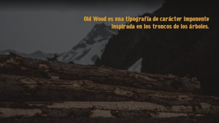
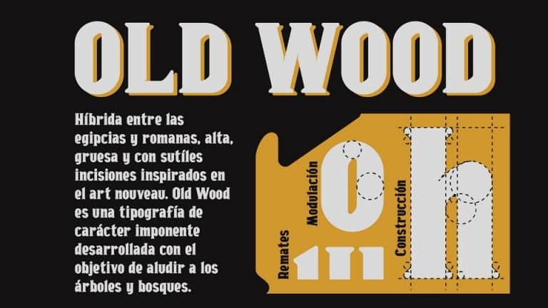
Old Wood Serif Font is perfect for your up coming projects. Such as logo branding, sport design, blog design, modern advertising design, card invitation, art quote, home decor, book/cover title, special events and any more. This font is designed and shared by Luis Jerez. It is a tall and thick typeface, a hybrid between Egyptian for the slight contrast of its lines, and ancient Roman for its finishes semi-rounded, plus incisions inspired by Art Nouveau.
Old Wood Serif Font is not very suitable for text, however it can be ideal for large headlines where the objective is to directly capture the reader’s attention.
Thanks Luis Jerez for creating such a great font!. This is free for personal & commercial use. Please download and enjoy, or can search more similar fonts on .
Download font
Free for Personal Use
This fonts are authors' property, and are either shareware, demo versions or public domain. The licence mentioned above the download button is just an indication. Please look at the readme-files in the archives or check the indicated author's website for details, and contact him if in doubt. If no author/licence is indicated that's because we don't have information, that doesn't mean it's free.
- Old Wood Regular oldwood.otf
Old Wood Regular | oldwood.otf
- Font family: Old Wood
- Font subfamily identification: Regular
- Unique identifier: Version 1. 001;;OldWood-Bold;2020;FLVI-620
- Full font name: Old Wood Bold
- Version: Version 1. 001
- Postscript font name: OldWood-Bold
- Designer: Luis Jerez
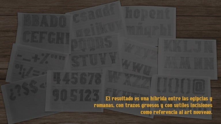
- Description: Con el objetivo de comunicar de manera imponente y a su vez aludiendo a la naturaleza de los arboles para generar conciencia sobre la deforestaci—n, se ha desarrollado esta tipografia alta y gruesa hibrida entre egipcia por el leve contraste de sus trazos, y romana antigua por sus remates semiredondeados, ademas de incisiones inspirados en el art nouveau. Debido al grosor de la tipografia y su peque–o ojo de la letra, esta tipografia no es muy adecuada para cuerpos de texto, sin embargo puede ser ideal para grandes titulares donde el objetivo es captar directamente la atencion del lector
Comments (0)
By Tom Jerry
Crash Soul fontPersonal Use Free

ROADSTORE fontPersonal Use Free
Chivo fontPersonal Use Free
Lastest fonts
Crash Soul fontPersonal Use Free
ROADSTORE fontPersonal Use Free
Chivo fontPersonal Use Free
Greatest Richmond fontPersonal Use Free
Marvelous Photograph Serif fontPersonal Use Free
Sweet Madelyn fontPersonal Use Free
Quache fontPersonal Use Free
samosan fontPersonal Use Free
Marrowish fontPersonal Use Free
FPD Pressure fontPersonal Use Free
Fair Judge Inline fontPersonal Use Free
Pillar Yellow Outline fontPersonal Use Free