Download free Pfeffer SG halbfett font - Free fonts download
(0 vote)
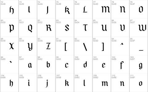
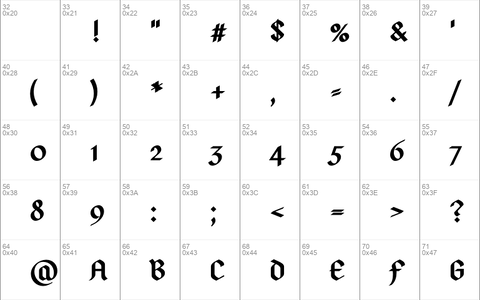
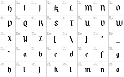
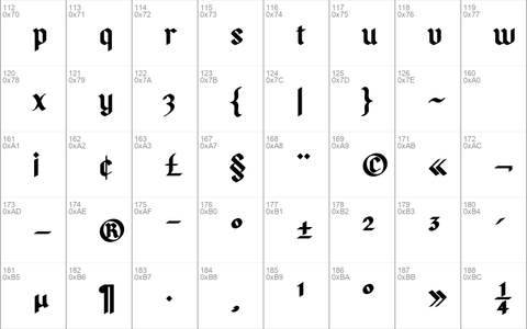
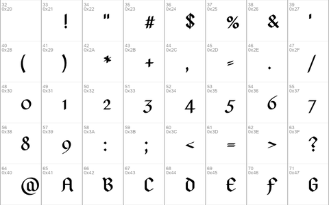
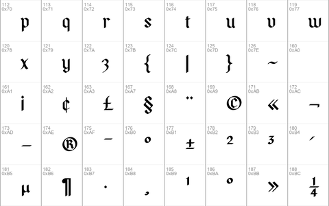
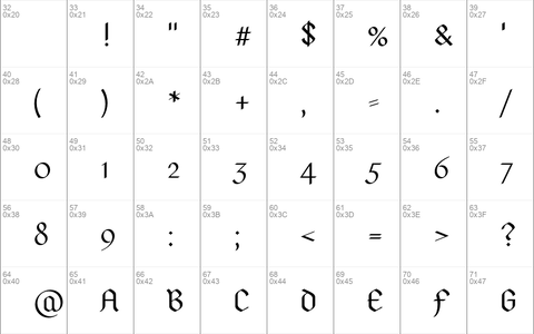
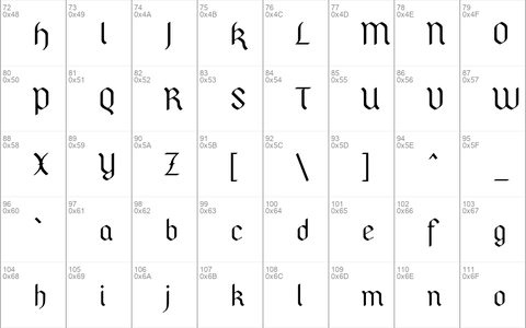
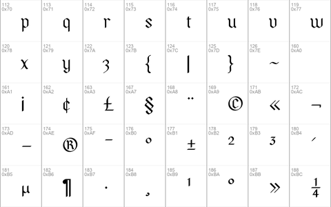
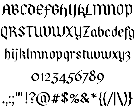
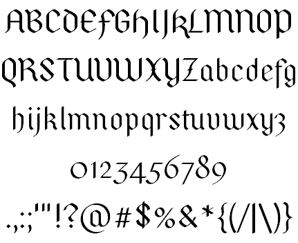
Download free Pfeffer SG halbfett font by Free fonts download free for Personal Use. Font list styles: PfefferSG halbfett.otf, PfefferSimpelgotisch fett.otf, PfefferSimpelgotisch halbfett.otf, PfefferSimpelgotisch normal.otf,
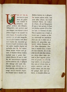
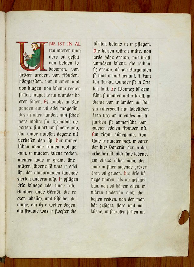
PFEFFER SIMPELGOTISCH is a particularly simple variant of the textura—that blackletter scripture which, starting from the 11th century with the advent of the Gothic style, had evolved from the Carolingian minuscule via the Gothic minuscule. The prevalent typeface of an age roughly reflects the era’s architecture: The Carolingian minuscule’s roundings correlate to the Romanesque round arches, while the textura’s letters are as peaked and as upright as Gothic architecture. Sans-serif on the contrary breathes the spirit of our concrete age, and antiqua is apparently to stand for anything in between, from Renaissance to Classicism. Following this finding, the pointed arch is the essential stylistic feature of Pfeffer Simpelgotisch, which for the rest is quite unornamental.
Author name: Robert Pfeffer, Hessen., email: [email protected]
Download font
Free for Personal Use
This fonts are authors' property, and are either shareware, demo versions or public domain. The licence mentioned above the download button is just an indication. Please look at the readme-files in the archives or check the indicated author's website for details, and contact him if in doubt. If no author/licence is indicated that's because we don't have information, that doesn't mean it's free.

