Download free Tempus Sans ITC font - Free fonts download
(0 vote)
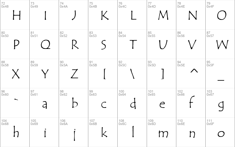
Download free Tempus Sans ITC font by Free fonts download free for Personal Use. Font list styles: TEMPSITC.ttf,


Download font
Free for Personal Use
This fonts are authors' property, and are either shareware, demo versions or public domain. The licence mentioned above the download button is just an indication. Please look at the readme-files in the archives or check the indicated author's website for details, and contact him if in doubt. If no author/licence is indicated that's because we don't have information, that doesn't mean it's free.
- Tempus Sans ITC TEMPSITC.ttf
Tempus Sans ITC | TEMPSITC.ttf
- Font family: Tempus Sans ITC
- Font subfamily identification: Regular
- Unique identifier: Tempus Sans ITC
- Full font name: Tempus Sans ITC
- Version: Version 1. 02
- Postscript font name: TempusSansITC
- Trademark notice: ITC Tempus Sans is a Trademark of International Typeface Corporation.
- Manufacturer name: International Typeface Corporation
- Designer: Phill Grimshaw
- Description: Phill Grimshaw developed an interest in type design while studying for his master's degree in design at the Royal College of Art in London between 1972 and 1975. Grimshaw claims that every calligrapher's aspiration is to render Roman capitals perfectly with a pen, but admits that it is very difficult to do. For ITC Tempus! " he used a fountain pen on cheap, porous paper, and as you would expect, the ink bled. The resulting letterforms are classically based, but have rugged edges, so they deviate from the 'preciousness' of hand lettered romans. Released in 1996, ITC Tempus is a parody of a classical roman design. It is dictated by proportions, particularly those of capitals. The lowercase is somewhat loose and uninhibited. "Tempus Sans is just Tempus with the serifs surgically removed, " Grimshaw says. "Yet the proportions of the characters work nicely. " Because of its toughness, the typeface works best at larger point sizes, yet maintains its characters when set at small sizes. You might consider it a "punk roman " that works where a roman face is desired, but the fine edge is not.
- License: Please contact the vendor to learn more about license restrictions.
#tempus#sans#itc#font#tempus sans#sans itc#itc font#tempus sans itc#sans itc font#tempus sans itc font#tempsitc-ttf#regular#tempus-sans-itc#sans serif#tempsitc#tempsitcttf#tempussansitc#international#typeface#corporation#international typeface#typeface corporation#international typeface corporation#phill#grimshaw#phill grimshaw
Comments (0)
Please login!
By Free fonts download
Madelina Script fontPersonal Use Free

Brother Lands fontPersonal Use Free
Southampton fontPersonal Use Free
Lastest fonts
Gorva-Demo fontPersonal Use Free
Montreau fontPersonal Use Free
Piazzolla Thin fontPersonal Use Free
SovMod fontPersonal Use Free
Sono ExtraLight fontPersonal Use Free
Tornado fontPersonal Use Free
MEDIO VINTAGE ROUGH fontPersonal Use Free
Cellotype fontPersonal Use Free
Great Hustle fontPersonal Use Free
COBAISSI fontPersonal Use Free
Autumn Days - Personal Use fontPersonal Use Free
TorreFarfan fontPersonal Use Free