Download free Tw Cen MT Condensed font - Free fonts download
(0 vote)
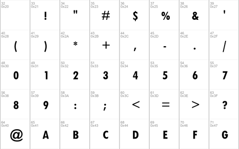
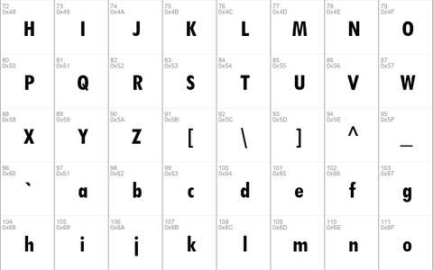
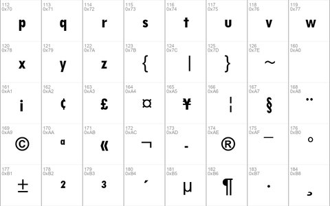
Download free Tw Cen MT Condensed font by Free fonts download free for Personal Use. Font list styles: TCCB____.TTF, TCCM____.TTF, TwCenMTCondensedBold.ttf,
Download font
Free for Personal Use
This fonts are authors' property, and are either shareware, demo versions or public domain. The licence mentioned above the download button is just an indication. Please look at the readme-files in the archives or check the indicated author's website for details, and contact him if in doubt. If no author/licence is indicated that's because we don't have information, that doesn't mean it's free.
Tw Cen MT Condensed | TCCB____.TTF
- Font family: Tw Cen MT Condensed
- Font subfamily identification: Bold
- Unique identifier: Monotype - Tw Cen MT Condensed Bold
- Full font name: Tw Cen MT Condensed Bold
- Version: Version 1. 02
- Postscript font name: TwCenMT-CondensedBold
- Trademark notice: Twentieth Centuryª is a trademark of The Monotype Corporation which may be registered in certain jurisdictions.
- Manufacturer name: Monotype Typography
- Designer: Sol Hess
- Description: 20th Century was designed and drawn by Sol Hess in the Lanston Monotype drawing office between 1936 and 1947. The first weights were added to the Monotype typeface library in 1959. This is a face based on geometric shapes which originated in Germany in the early 1920's and became an integral part of the Bauhaus movement of that time. Form and function became the key words, unnecessary decoration was scorned. This clean cut, sans serif with geometric shapes was most appropriate. The lighter weights can be used for text setting, the bold and condensed fonts are suitable for display in headlines and advertising.
Tw Cen MT Condensed | TCCM____.TTF
- Font family: Tw Cen MT Condensed
- Font subfamily identification: Regular
- Unique identifier: Monotype - Tw Cen MT Condensed
- Full font name: Tw Cen MT Condensed
- Version: Version 1. 02
- Postscript font name: TwCenMT-Condensed
- Trademark notice: Twentieth Centuryª is a trademark of The Monotype Corporation which may be registered in certain jurisdictions.
- Manufacturer name: Monotype Typography
- Designer: Sol Hess
- Description: 20th Century was designed and drawn by Sol Hess in the Lanston Monotype drawing office between 1936 and 1947. The first weights were added to the Monotype typeface library in 1959. This is a face based on geometric shapes which originated in Germany in the early 1920's and became an integral part of the Bauhaus movement of that time. Form and function became the key words, unnecessary decoration was scorned. This clean cut, sans serif with geometric shapes was most appropriate. The lighter weights can be used for text setting, the bold and condensed fonts are suitable for display in headlines and advertising.
Tw Cen MT Condensed | TwCenMTCondensedBold.ttf
- Font family: Tw Cen MT Condensed
- Font subfamily identification: Bold
- Unique identifier: Monotype - Tw Cen MT Condensed Bold
- Full font name: Tw Cen MT Condensed Bold
- Version: Version 1. 01
- Postscript font name: TwCenMT-CondensedBold
- Trademark notice: Twentieth Centuryª is a trademark of The Monotype Corporation which may be registered in certain jurisdictions.
- Manufacturer name: Monotype Typography
- Designer: Sol Hess
- Description: 20th Century was designed and drawn by Sol Hess in the Lanston Monotype drawing office between 1936 and 1947. The first weights were added to the Monotype typeface library in 1959. This is a face based on geometric shapes which originated in Germany in the early 1920's and became an integral part of the Bauhaus movement of that time. Form and function became the key words, unnecessary decoration was scorned. This clean cut, sans serif with geometric shapes was most appropriate. The lighter weights can be used for text setting, the bold and condensed fonts are suitable for display in headlines and advertising.


